
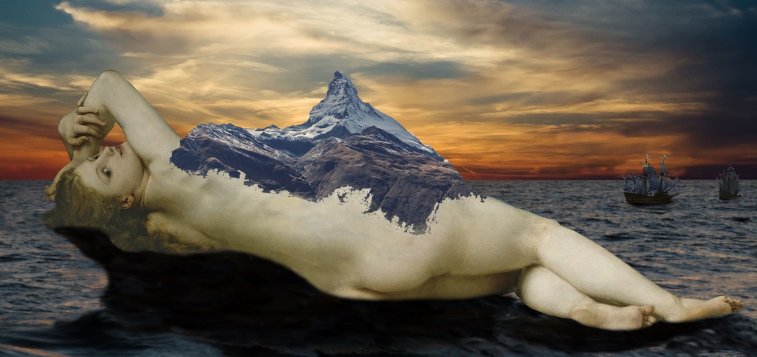
Reina del paraíso
sclass: Digital Art
year: 2017
materials: Photoshop
For my dreamscape project I had many ideas. I started eliminating the ones that I knew would be too complicated for me. I would say this project reminds me of the ending of the movie ¨Moana¨. The part of the movie i´m talking about is when Te Fiti turns back to being peaceful and normal. All I wanted to do for this project was create an island with life, but instead of having her be good, she was bad. A short summary of the story is that the island lady was cursed and now every ship that passed through there, ends up getting wrecked by the sides of her mountains. This project was something completely new for me, it was my introduction to Photoshop. I would say this was so much easier than Adobe Illustrator.
|
|
|
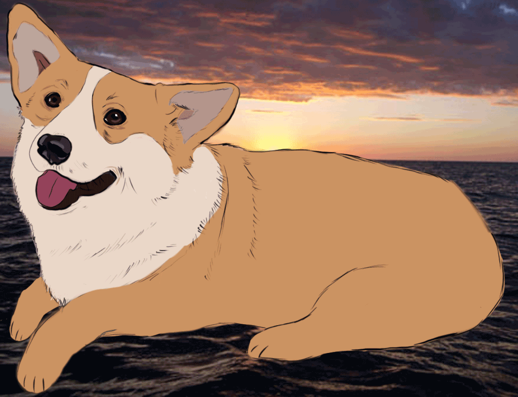
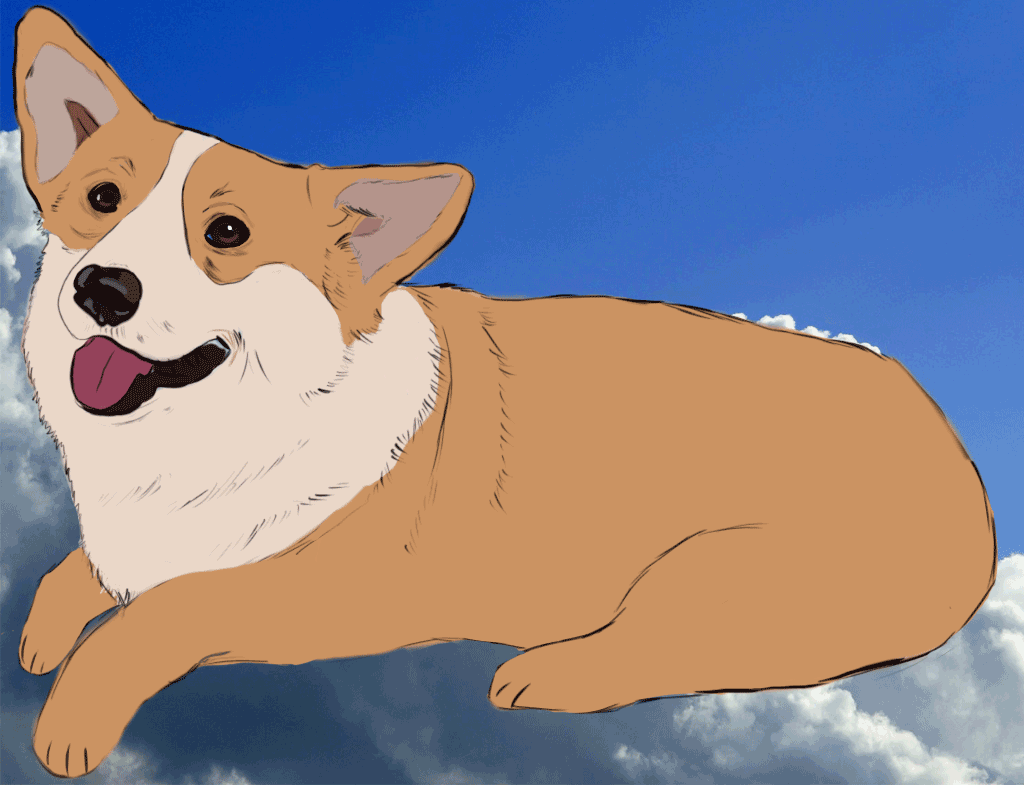
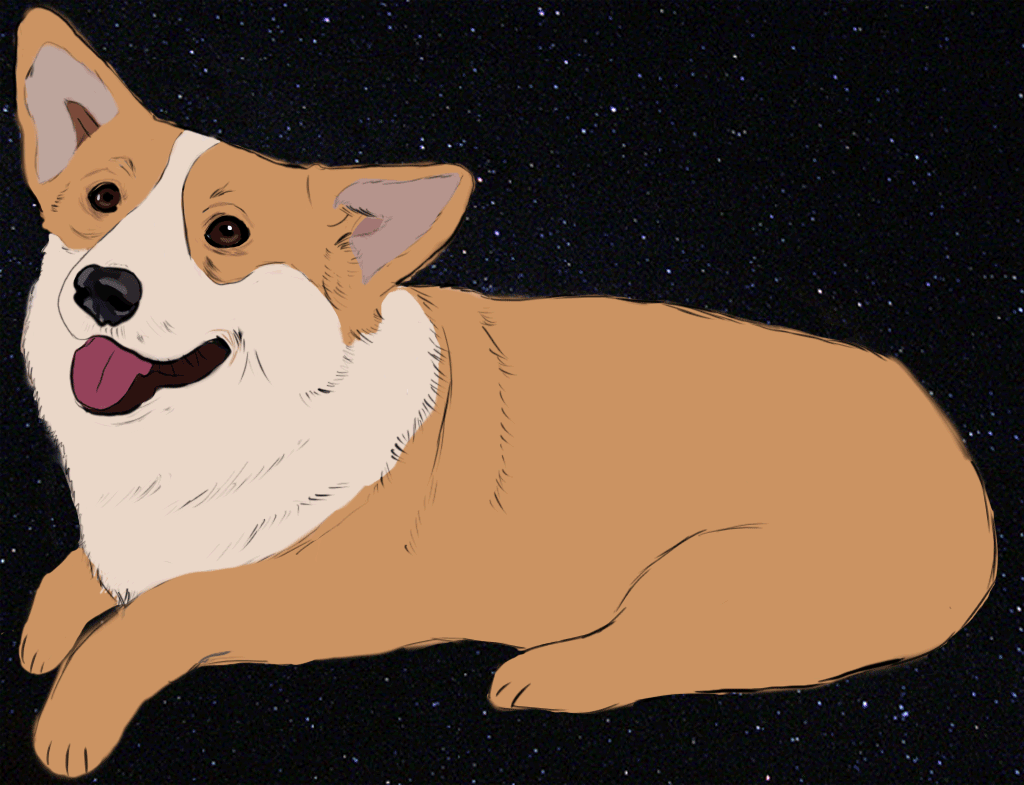
Swimmin´ round the world in my 64
class: Digital Art
year: 2017
materials: Photoshop
For this GIF, I chose to go with something i´ve always wanted to do. I was a little familiar with GIF´s before because of my DSI, but when I started working with GIF on Photoshop, it was so much more complicated. I eventually got the hang of Photoshop and I used the drawing tablet which made it much easier for me. I used the drawing tablet to trace the dog, which is the part that took the longest to finish. I really enjoyed using the drawing tablet because I had better control of the lines and it was easier to create detail. I got my inspiration from a video my friend sent me a while back. I thought the video was the cutest thing ever so I wanted to recreate it.
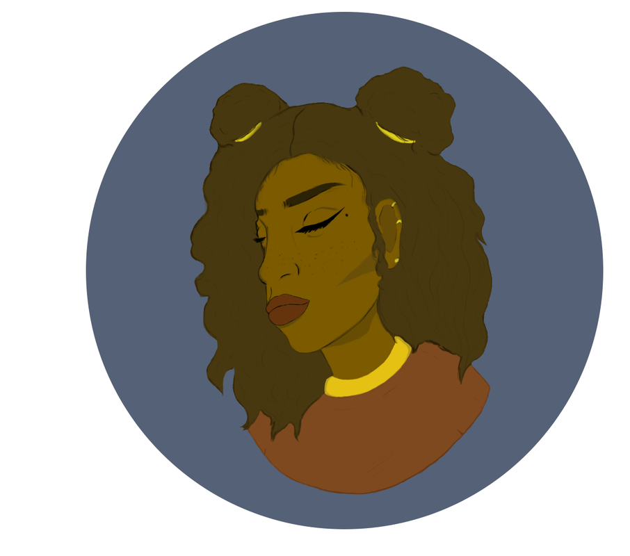
Lilac
class: Digital Art
year: April 22, 2017
material: Photoshop
In this art piece I wanted to show peace and calmness. I ended up using the most common color scheme that I use in just about every art piece I make. The color scheme is orange, yellow, and blue. I always use these colors because they remind me of the ocean and the sun set. To me those two things are so beautiful and calming to me. This art piece got its name from the background color. The color is a blue, but in different devices it seems to look more of a purple. It might just be me, but that´s how it got it´s name. Since the girl in this art piece got cut off from the shoulders down, Mrs.Singleton gave me an idea on making the background round as well. I think that made this art piece look a lot better and more pleasing to the eye. Just like Splinter 01, I would put this on one of the shirts as well.
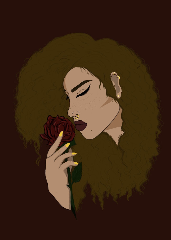
Splinter 01
class: Digital Art
year: May 10th , 2017
material: Photoshop
This art piece was inspired by a drawing I made a while back. The drawing was just a sketch that I made and never finished. My plan was to add color to it, but I wanted it to look very neat and detailed. I first I wanted to paint this onto a canvas, but I knew that detail would be hard for me to show in a painting. Instead I traced it on Photoshop and colored it through there, I´d have to say it was one of the best choices iv´e ever made. When I was working on this project it also reminded me of one of the logos I designed. The logo is called Splinter. I want to create a t-shirt with the logo I designed and this art piece on the back. The logo of Splinter is very similar to the girls hand on this piece. Except there are small changes. The meaning this project shows is chaos and peace. The background is chaos and the girl is showing peace with the flower in her hand. The color scheme I used helped send the message, I would say I used the right amount of dark colors as well as bright ones.
