
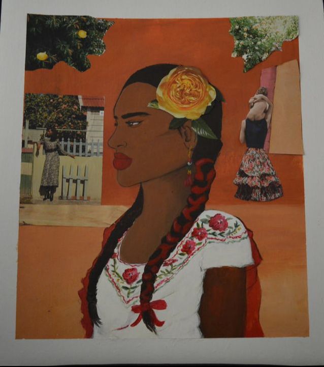
Rojo y amarillo
Class: Advanced visual studies
Materials: acrylic paint and collage
year: 2018
This piece was inspired by Mexican women. I have respect for the women who raise kids on their own and put their kids before them, the women who work day and night to raise a family on their own, the women who have multiple jobs just to make a little extra. In Mexico I see many kids growing up without a father figure and I just wanted to show appreciation for the good women who have raised their children right even if it was stressful. The image of the women in the middle represents independence. Women are strong, we don't need anyone pulling us down. There are only women in the background and I chose that to only focus on women. I want the audience to look at this women and be like " she's an independent women, she don't need no man". Women are strong human being who only deserve happiness and appreciation. Each good mother should be appreciated and never forgotten about.
Empire
Class: Advanced visual studies
Year: 2017
Material: Acrylic
This piece was also inspired by my trip to Mexico this year. As I was saying for the piece “La tienda de la Esquina” , I felt like I had more of a connection with Mexico, than I did before. I would say that is because I’m older now, meaning I’m allowed to do many more things than I could when I was younger. I also noticed that I learned to love those small things about Mexico. I loved how imperfect the building were, how they had cracks, and paint almost coming off the walls. I loved the variety of colors people would paint their homes, it's something you don’t really see here. I loved how everyone knew each other and they seemed so happy, to where here at times I feel isolated. But what I loved most about Mexico was going on top of roof, just to see the gorgeous views of all those small lights miles away. The views from my cousins roof, inspired this painting. It was originally a picture I took but I decided to make it into a painting because the colors and details were very hard to see in the picture. I would say the colors used, he blues, reds, yellows, browns, and oranges in this painting went very well with my message. My message was realizing the beauty in small things. That is also where the title “Empire” came from. The feeling of you on that roof looking over everything makes you feel so invincible. In this painting I do not have a person physically on there, because it is more about the audience feeling like they can see the beautiful scenery with their own eyes.
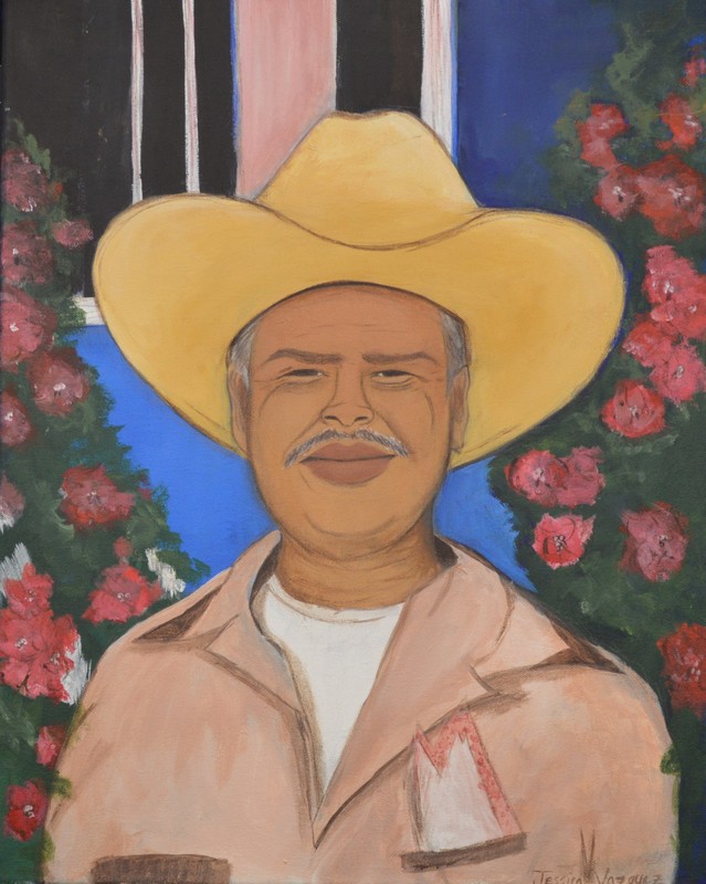
Abuelo
Class: Advanced Visual Studies
Year: 2017
Materials: Acrylic
This piece was inspired by someone who meant the world to me. Someone who made me realize who I was and what I enjoyed in life. Someone who made me realize my love for animals was so strong, and my personality so bold. And that is my Grandpa. Growing up, we were fortunate to have my grandpa be able to travel to the United states at times to visit. He would come as much as possible, because it was hard for us to go down there at times. My grandpa was the sweetest, most genuine person I ever knew. He was the one who showed me to never be afraid of animals because they are pure. Which did not mean that if I saw a tiger to stick my hand in to pet it, he obviously told me to stay safe. But it showed me to always stand against animal abuse, to never hurt them or anymore, to always show love and respect if you want it to be shown back. My Grandpa helped me find a huge part of who I was, and I will always appreciate everything he has done for us. I decided to make a painting about my Grandpa for my dad as a Christmas present. Sadly a couple years back my grandpa passed away, and he was really the only one who would bring family together. Meaning after that my dad stopped going to Mexico, because he said it didn’t feel the same anymore. Which he was right, without my grandpa everyone became so distant. I decided to make the painting because my grandpa wasn’t only important to me, but especially to my dad. I did have a reference photo for this painting, but I wanted to add my style and colors to it since the picture was blurry. The colors and how I decided to set them up make my grandpa look like the main focus. The meaning behind the picture is to show my grandpa’s personality. I think the colors really capture his genuine and friendly side. Who was exactly the kind of person he was. I did manage to finish this painting, but eventually I feel like I will add something small to complete it.
|
|
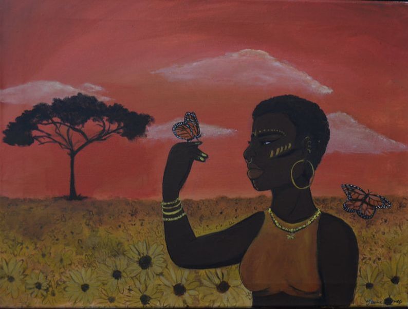
Sombra
class: Advanced visual studies
year: 2017
material: Acrylic
In this art piece I wanted to get out of my comfort zone. I managed to do that with the color scheme. For this project I planned to make a girl in a field of sunflowers expressing beauty. I didn't just want the flowers to express the beauty , so I went into more debt. I wanted to also indicate that beauty isn't only about looks, but who you are as a person. Looks aren't everything and I feel like nowadays we don't realize that. You could be attractive, but it all comes down to who you are to yourself and to everyone else. You don't have to be a certain color or have a certain feature to be beautiful. I wanted the color scheme of red and yellow to really pop out because red is a very powerful color and yellow just balances it out. These colors would work perfect for the meaning I am trying to express. A new touch that I decided to add was the tree. I think adding the tree was a very good idea because it made the painting not feel as lonely.
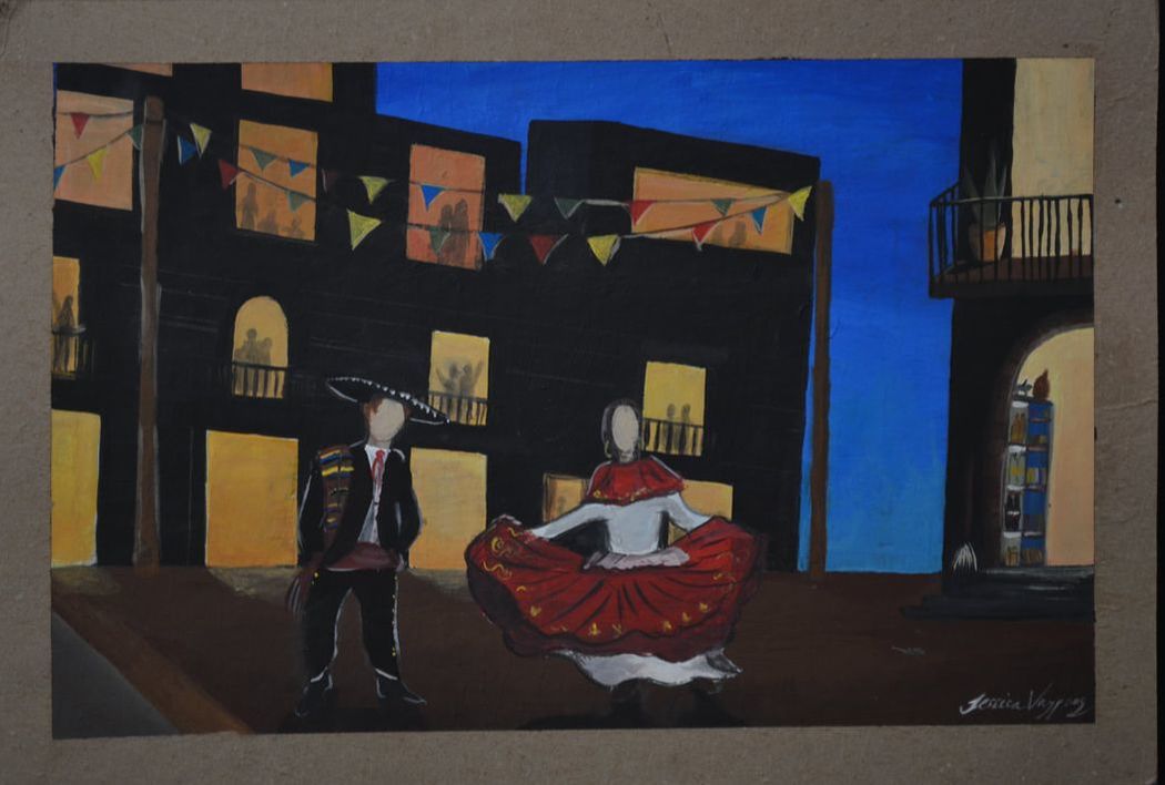
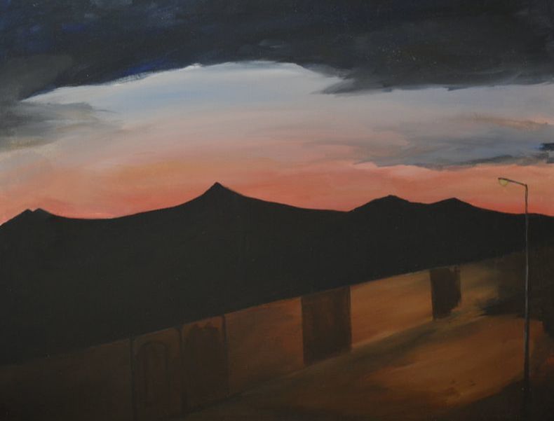
La Tienda de la Esquina
class: Advanced Visual studies
year: 2017
material: Acrylic
In this art piece I was inspired by my trip I took to Mexico this summer. Out of all the other times I've been to Mexico, this one stuck with me. I've always appreciated Mexico's style, but never really thought much of it until now. I noticed how beautiful Mexico is in the morning and especially at night. I would say the think that struck me most was when I went to the roof of my grandma and saw all these bright beautiful lights that went around the mountain. So for this project I wanted to do something that would give everyone a feeling of Mexico. I know many people don't go onto roofs, so I did something more traditional. I chose to do people dancing bailes floncloricos. The color scheme is going to be brighter/ happier colors, because they are used most. I want the audience to get a vibe of Mexico. (incomplete)
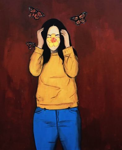
Self- Portrait
class: English
year: 2017
material: Acrylic
This project was not originally for an art class, I actually made it for English III. I wanted to paint myself for the first time and I thought this was the right opportunity to do that. I expressed who I was as a person with the color scheme and the butterflies. I used yellow, blue, and orange, because I would say the describe me the most. Yellow is more of my soft side ( also my favorite) , orange describes my creative side , and blue makes me think about meaning and dept. In a way I feel like they all go together, to create a big part of my art style. This project was just meant for a English project, but it means much more to me now.
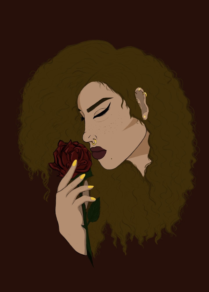
Splinter 01
class: Digital Art
year: May 10th , 2017
material: Photoshop
This art piece was inspired by a drawing I made a while back. The drawing was just a sketch that I made and never finished. My plan was to add color to it, but I wanted it to look very neat and detailed. I first I wanted to paint this onto a canvas, but I knew that detail would be hard for me to show in a painting. Instead I traced it on Photoshop and colored it through there, I´d have to say it was one of the best choices iv´e ever made. When I was working on this project it also reminded me of one of the logos I designed. The logo is called Splinter. I want to create a t-shirt with the logo I designed and this art piece on the back. The logo of Splinter is very similar to the girls hand on this piece. Except there are small changes. The meaning this project shows is chaos and peace. The background is chaos and the girl is showing peace with the flower in her hand. The color scheme I used helped send the message, I would say I used the right amount of dark colors as well as bright ones.
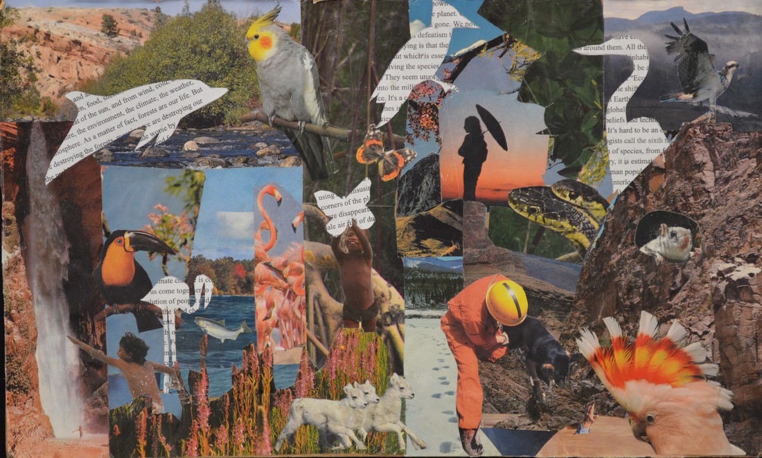
Animal Kingdom
Supplies: Cardboard, Gel medium , Magazine cut outs, and regular sheets of paper.
Graphic Design, 2016
For this project, I decided to not to use Adobe Illustrator or any technology. I decided to make a collage. When I was planning out what I was going to do for this project, a collage kept coming to mind. At first I wanted to make a collage of different type faces like Helvetica , but I chose to go with something i´m more passionate about. My idea for this project was to show and remind the audience about the beauty there is in nature. I was inspired from a crisis that is going on still in today´s world, where so many animals and their habitats are getting destroyed to benefit us. Just like us, ANIMALS AND NATURE MATTER. The world would be so boring and dull without the bright and colorful colors nature itself provides. I feel like the collage was a perfect way to show different pieces of nature. Since this project was typography, I outlines some of the animals and filled them in with an article about the environment. I was very proud of this collage because all of the colors went together very well, and the article also balanced out everything that was going on around it.
|
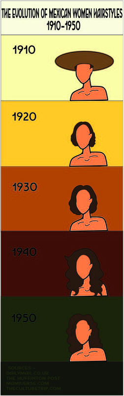
Adobe Illustrator
Graphic Design , 2016
For this project, I was inspired by a video I saw on the internet. The video was showing the evolution of beauty in Mexican women as years went by. I wanted to create a timeline to show the differences of the hairstyles. What really caught my eye from the video was the hairstyles. I recognized some of the hairstyles from older pictures I saw in Mexico that my grandma had stored. The pictures were of her when she was younger. I also saw a unique style to my mom as well when she was growing up. I chose the color scheme from Pinterest. I wanted to choose colorful colors because when I think Mexico, I think about the variety of colors used in celebrations and decorations for cultural events. It was difficult to look up some of the hairstyles because the video would always show up, so I had to look them up separately. At first I was going to make 10 slides on the timeline but I ran out of time. I got done with what I could and I was very happy with the final project.
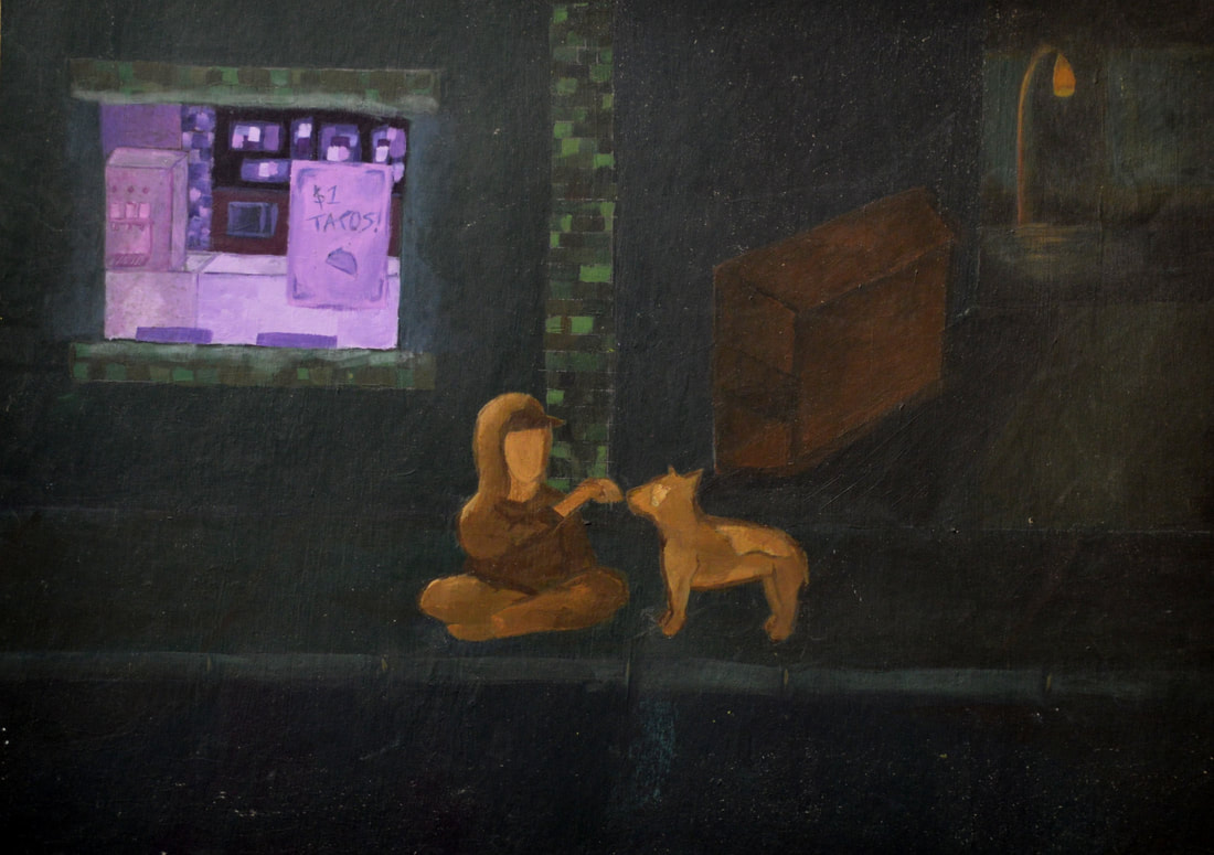
Late night tacos
class : painting
year: 2016
Materials: brush, masking tape, paint, Palet knife , palet and paper towels.
For this art piece I was inspired by the darkness and light in overall places. Light as in light in cities , in cars, or even a street light has always inspired me. I really like how light and darkness go well together to create a theme kinda, making the light the main focus and the darkness just a background. I chose green, orange , and purples for my colors. I chose green for my main color , because when I think allies I think shades of greens. Green is a good color to represent darkness. I chose my main focus to be the window and I chose purple for it. The window represents light and brightness. My last color was orange and that was gonna be the color I used for the person, dog, dumpster , and background light. I did good on the window , but I need to practice on putting colors together, even if it's very little.
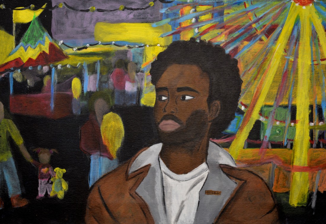
Endless memories
Class: Art foundations
Year: 2015
This art piece was inspired by one of my favorite music artist, Donald Glover (a.k.a Childish Gambino). His music has inspired me and I feel like many of his music has a meaning to it. The song I chose by him was 3005, the song makes me feel depressed at points but then makes me feel relieved. On my painting I want my audience to understand the color and the meaning behind it. What I mean is that the background of the painting has all these bright color which symbolize happiness, joy, harmony, love, passion and relaxation all positive colors. And the main focus , which is Childish Gambino is painted with colors like shades brown, white, black , pink and grey which symbolize depression, hope, jealousy , ignorance , and selfishness. I called my piece of art "Endless Memories" because of the memories the song brings to me and how on the video he is going round and round on a faris wheel as everything is getting older in the background.
