
Pattern / Rhythm
Adobe Illustrator
Graphic Design , 2016
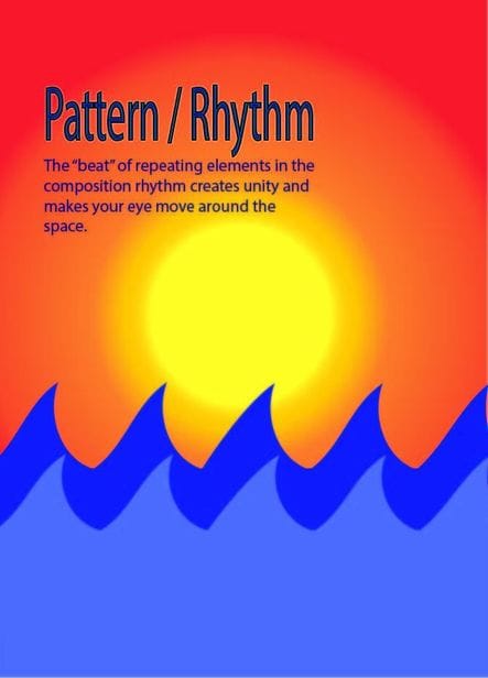
On this project the first thing I thought when I saw pattern and rhythm was waves. I thought more of a cartoon like waves because realistic waves usually don´t have pattern, they go their own ways. The rhythm/ pattern on my poster are the waves, they have the same arched wave repeating to make it seem like one big pattern. The color scheme I chose was blue , orange and yellow. Those three color remind me of the location where you´d find waves. For this project I want my audience to think about the waves and the area around it. I want them to see the rhythm and pattern in the waves and how I used them to describe my principle of design.
Graphic Design , 2016
On this project the first thing I thought when I saw pattern and rhythm was waves. I thought more of a cartoon like waves because realistic waves usually don´t have pattern, they go their own ways. The rhythm/ pattern on my poster are the waves, they have the same arched wave repeating to make it seem like one big pattern. The color scheme I chose was blue , orange and yellow. Those three color remind me of the location where you´d find waves. For this project I want my audience to think about the waves and the area around it. I want them to see the rhythm and pattern in the waves and how I used them to describe my principle of design.
Animal Kingdom
Supplies: Cardboard, Gel medium , Magizine cut outs, and regular sheets of paper.
Graphic Design, 2016
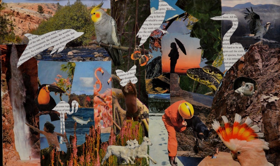
For this project, I decided to not to use Adobe Illustrator or any technology. I decided to make a collage. When I was planning out what I was going to do for this project, a collage kept coming to mind. At first I wanted to make a collage of different type faces ike Helvetica , but I chose to go with something i´m more passionate about. My idea for this project was to show and remind the audience about the beauty there is in nature. I was inspired from a crisis that is going on still in today´s world, where so many animals and their habitats are getting destroyed to benefit us. Just like us, ANIMALS AND NATURE MATTER. The world would be so boring and dull without the bright and colorful colors nature itself provides. I feel like the collage was a perfect way to show different pieces of nature. Since this project was typography, I outlines some of the animals and filled them in with an article about the enviroment. I was very proud of this collage because all of the colors went together very well, and the arcticle also balanced out everything that was going on around it.
Graphic Design, 2016
For this project, I decided to not to use Adobe Illustrator or any technology. I decided to make a collage. When I was planning out what I was going to do for this project, a collage kept coming to mind. At first I wanted to make a collage of different type faces ike Helvetica , but I chose to go with something i´m more passionate about. My idea for this project was to show and remind the audience about the beauty there is in nature. I was inspired from a crisis that is going on still in today´s world, where so many animals and their habitats are getting destroyed to benefit us. Just like us, ANIMALS AND NATURE MATTER. The world would be so boring and dull without the bright and colorful colors nature itself provides. I feel like the collage was a perfect way to show different pieces of nature. Since this project was typography, I outlines some of the animals and filled them in with an article about the enviroment. I was very proud of this collage because all of the colors went together very well, and the arcticle also balanced out everything that was going on around it.
Li(f)e
Adobe Illustrator
Graphic Design , 2016
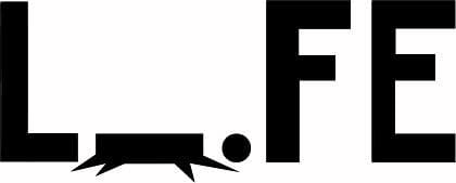
For my logo project I was inspired by a conversation we were having in literacy. The table I was sitting at started to talk about how much life sucked and how it had them stressing out. When I heard that I began to sketch out many different ideas consisting on the word life. Then I notcied that the letter I stood for a person. I decided to make the ¨I¨ falling as if it were a person falling down. I decided to only make it black and white to make it look simple.
Graphic Design , 2016
For my logo project I was inspired by a conversation we were having in literacy. The table I was sitting at started to talk about how much life sucked and how it had them stressing out. When I heard that I began to sketch out many different ideas consisting on the word life. Then I notcied that the letter I stood for a person. I decided to make the ¨I¨ falling as if it were a person falling down. I decided to only make it black and white to make it look simple.
Evolution of Mexican Women Hairstyles
Adobe Illustrator
Graphic Design , 2016
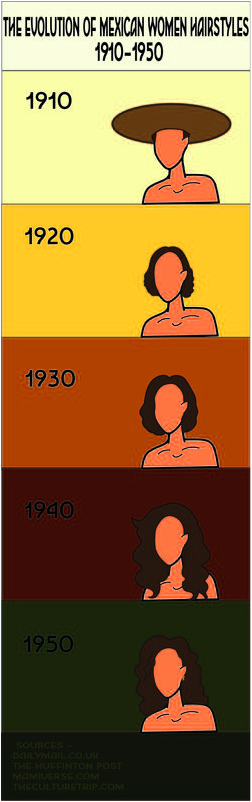
For this project, I was inspired by a video I saw on the internet. The video was showing the evolution of beauty in Mexican women as years went by. I wanted to create a timeline to show the differences of the hairstyles. What really caught my eye from the video was the hairstyles. I recognized some of the hairstyles from older pictures I saw in Mexico that my grandma had stored. The pictures were of her when she was younger. I also saw a unique style to my mom as well when she was growing up. I chose the color scheme from Pinterest. I wanted to choose colorful colors because when I think Mexico, I think about the variety of colors used in celebrations and decorations for cultural events. It was difficult to look up some of the hairstyles because the video would always show up, so I had to look them up separately. At first I was going to make 10 slides on the timeline but I ran out of time. I got done with what I could and I was very happy with the final project.
